REDESIGNING THE KLENTY APPLICATION CADENCE FEATURE
REDESIGNING THE KLENTY APPLICATION CADENCE FEATURE
Klenty is a sales Engagement Software to send personalized emails & automated follow-ups at scale, faced a significant issue with its cadence creation flow. Users were experiencing a high dropout rate due to the flow's cluttered interface and lack of visual coherence, which hindered their ability to complete the process effectively.
Klenty is a sales Engagement Software to send personalized emails & automated follow-ups at scale, faced a significant issue with its cadence creation flow. Users were experiencing a high dropout rate due to the flow's cluttered interface and lack of visual coherence, which hindered their ability to complete the process effectively.
Klenty is a sales Engagement Software to send personalized emails & automated follow-ups at scale, faced a significant issue with its cadence creation flow. Users were experiencing a high dropout rate due to the flow's cluttered interface and lack of visual coherence, which hindered their ability to complete the process effectively.
Reducing User Dropout Rate to Zero Through Enhanced Usability
Reducing User Dropout Rate to Zero Through Enhanced Usability
Reducing User Dropout Rate to Zero Through Enhanced Usability
Reducing User Dropout Rate to Zero Through Enhanced Usability
Understanding the Purpose
Understanding the Purpose
Using Design Thinking Process to Solve the Problem
Outcome from the Design Process
Reflection from Designing Cadence Flow
The primary purpose of my work on the Klenty email cadence workflow was to rebuild and enhance the user experience. The original workflow was cluttered and lacked visual coherence, leading to a high dropout rate as users struggled to complete the process. My objective was to redesign the workflow with a clear, minimalistic approach that improves usability and effectiveness.
The process involved design thinking, starting with data gathering from user interactions, specifically focusing on the dropout rate. Requirements for the feature were then obtained from the product manager. Next, low-fidelity wireframes were designed. From these iterations, two design flows were selected and launched as beta versions to two sets of users.
The process involved design thinking, starting with data gathering from user interactions, specifically focusing on the dropout rate. Requirements for the feature were then obtained from the product manager. Next, low-fidelity wireframes were designed. From these iterations, two design flows were selected and launched as beta versions to two sets of users.
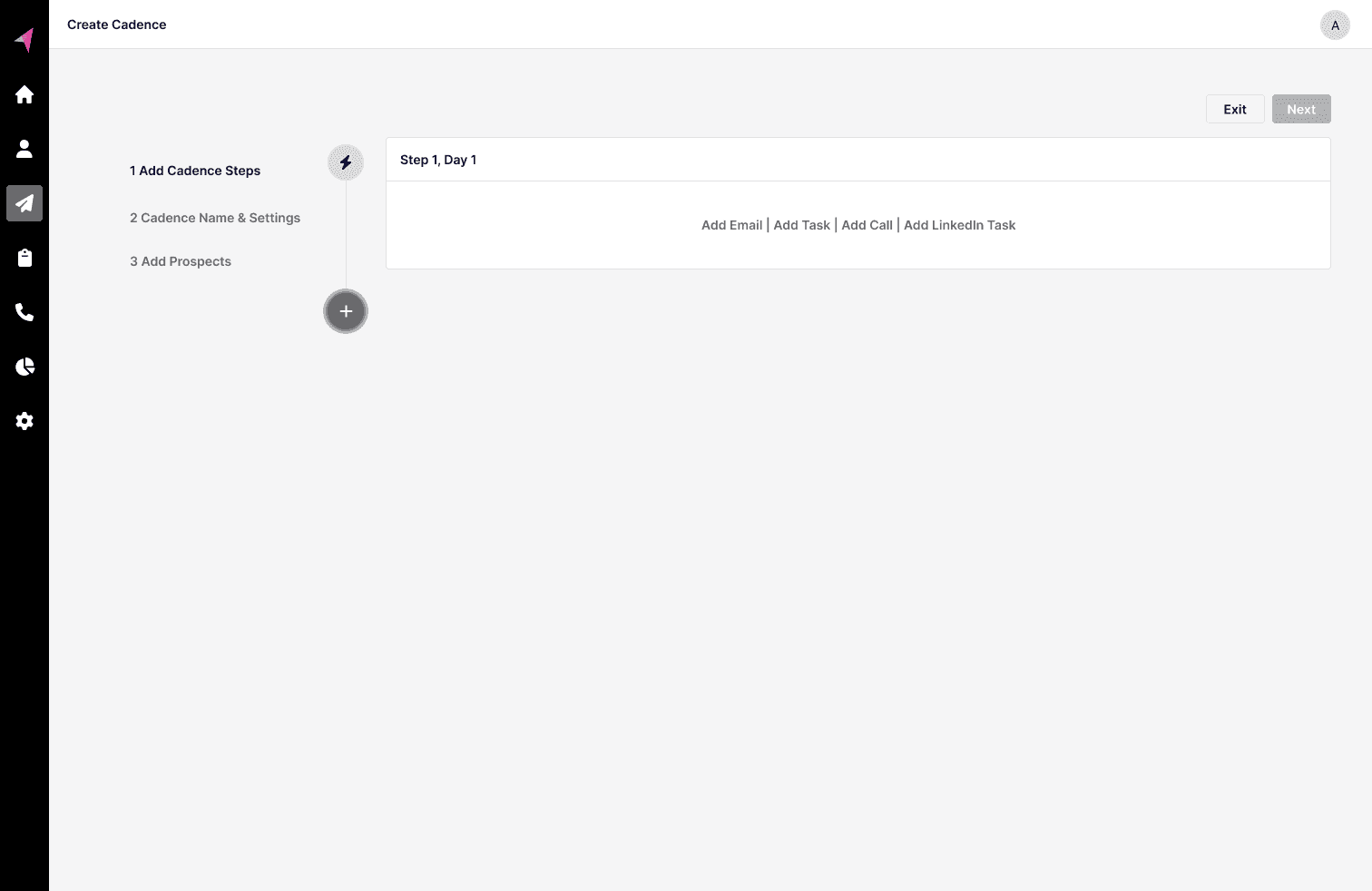
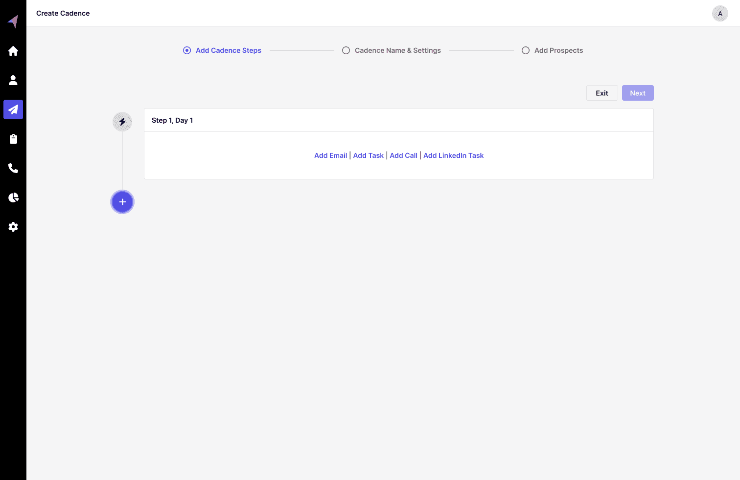
Iteration 1 focused on the left navigation of steps, but this design led users to perceive the steps as clickable, which was not the intended functionality.
Iteration 1 focused on the left navigation of steps, but this design led users to perceive the steps as clickable, which was not the intended functionality.
The two best iterations, the 2nd and 3rd, were selected for prototyping and A/B testing to evaluate user adoption and understand dropout rates.
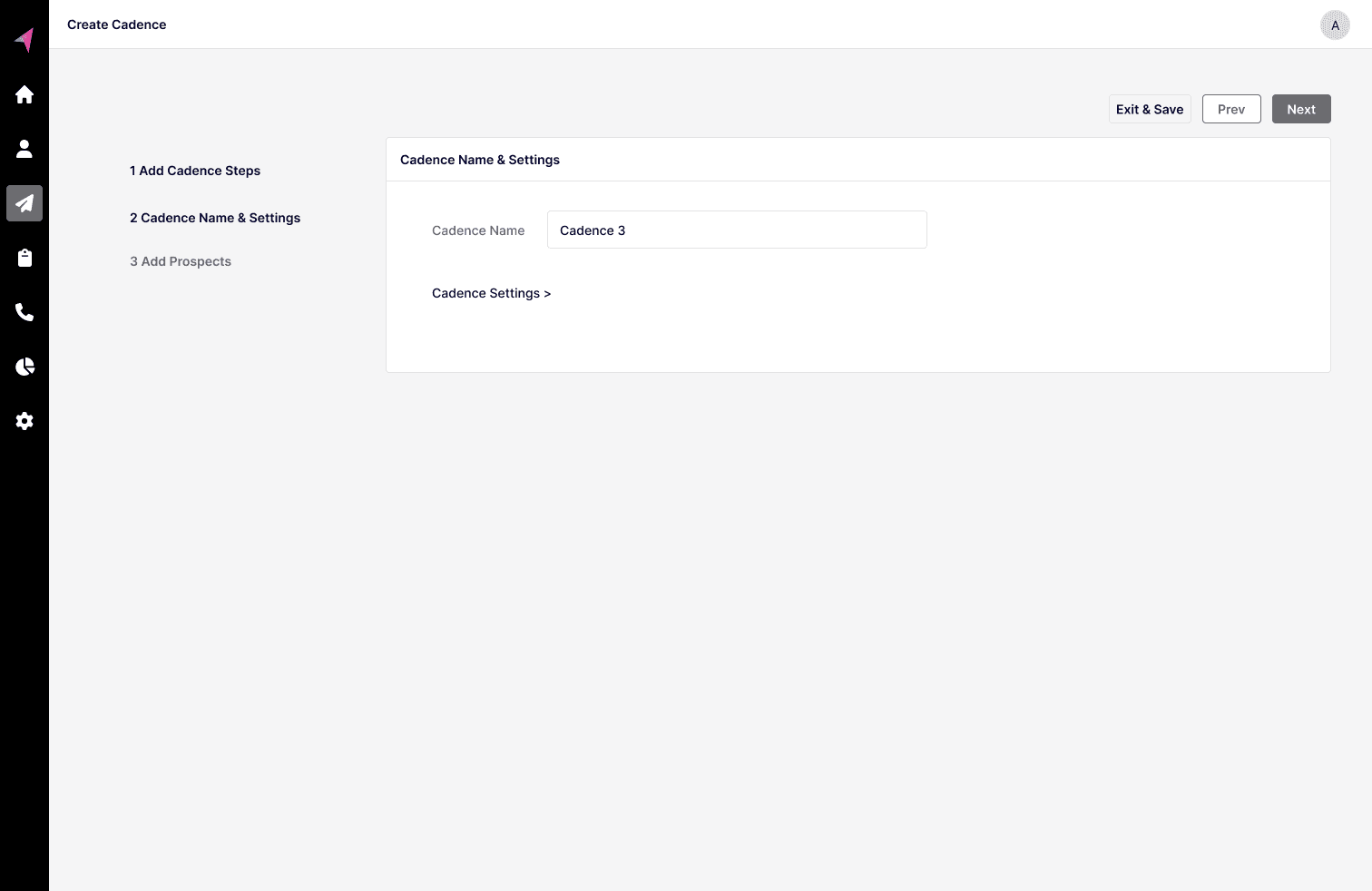
Hi Fidelity wireframes of iteration 2 and 3.
Hi Fidelity wireframes of iteration 2 and 3.
Hi Fidelity wireframes of iteration 2 and 3.
From the A/B testing performed using 2 groups of users, it was noted that Version 2 had a higher dropout rate because users found it easy to close the modal, with some accidentally closing it. In contrast, Version 3 showed higher user adoption compared (2x users started the Cadences) to the current live version, and dropout rates were almost negligible.
In reflecting on my work, I plan to focus on making user interfaces simpler by reducing the number of choices and elements further from the screen. According to Hick's Law, having too many options can make it harder for users to make decisions. By cutting down on unnecessary elements, I aim to reduce the mental effort required from users and make the experience smoother and more intuitive. This approach will help users make decisions more quickly and easily, improving their overall interaction with the product.
Iteration 2 proposed displaying the entire flow in a full-size modal. While this approach made users feel as though they were stepping away from the app, it had the advantage of being less cluttered and allowed users to focus on fewer elements.
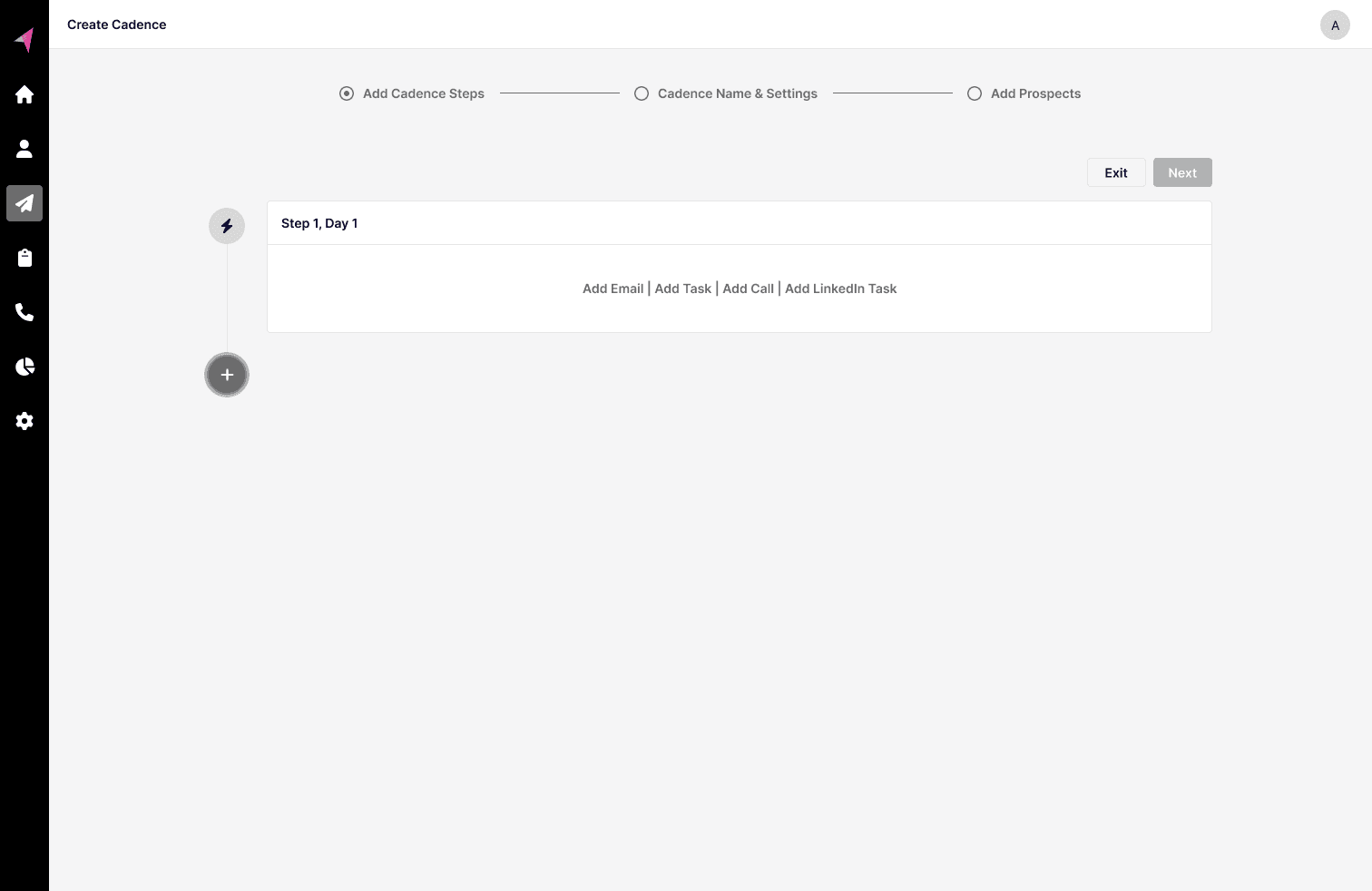
Iteration 3 provided users with a clear indication of their current step and established a visual hierarchy that made it evident which element to proceed with next.
Iteration 3 provided users with a clear indication of their current step and established a visual hierarchy that made it evident which element to proceed with next.
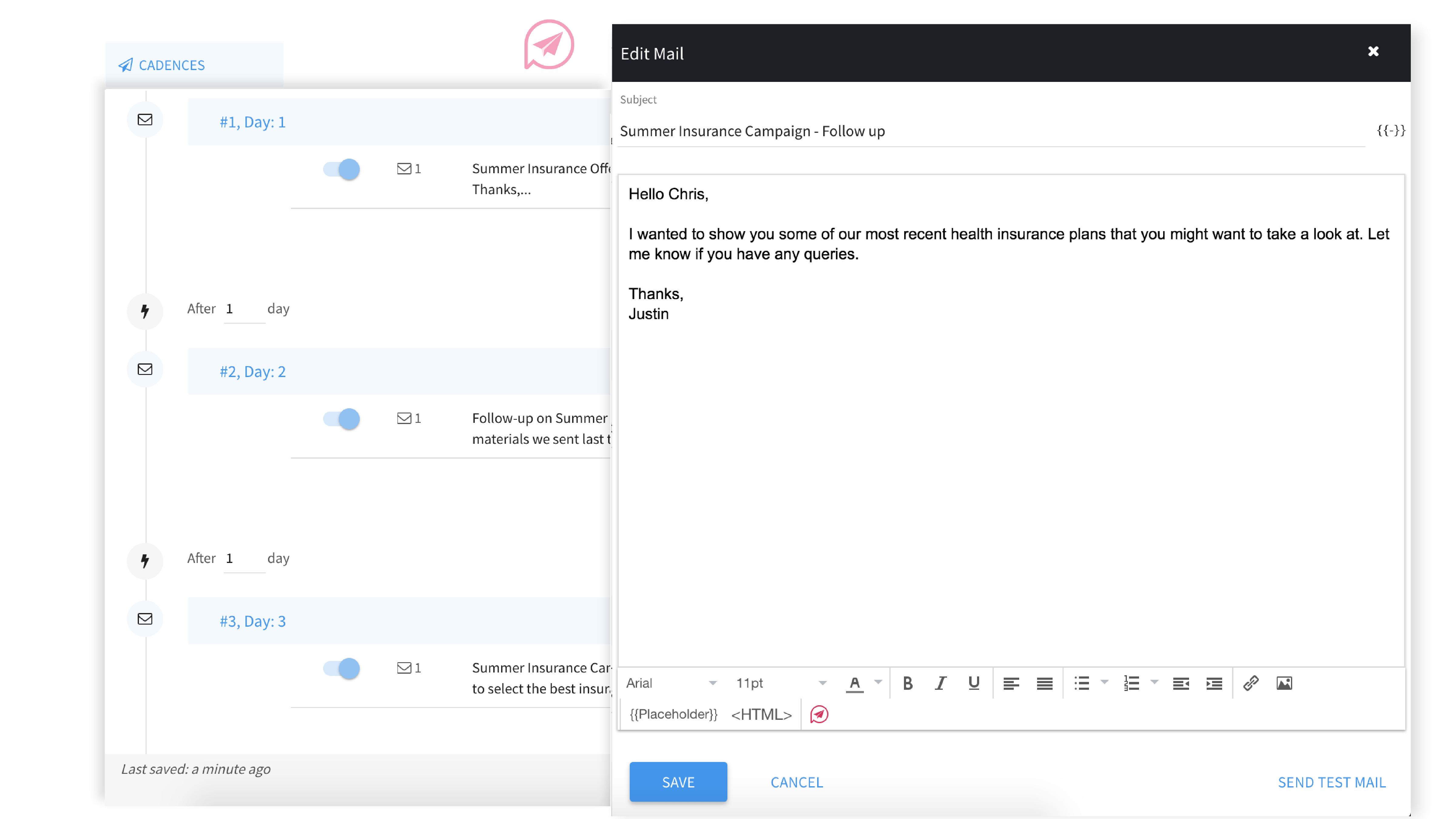
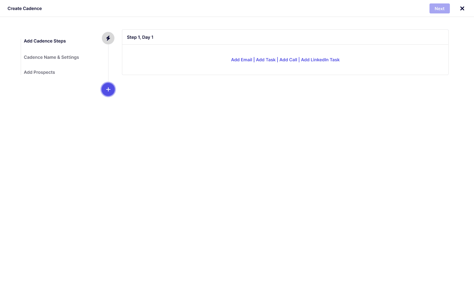
Screenshots of old application version with lacking visual coherence and unclear next steps.
Screenshots of old application version with lacking visual coherence and unclear next steps.
Screenshots of old application version with lacking visual coherence and unclear next steps.
Using Design Thinking Process to Solve the Problem
Outcome from the Design Process
Reflection from Designing Cadence Flow